In “The Independent Musician’s Guide to Not Going Broke“, I made a strong case for what is now the conventional wisdom in finance: That putting away a good chunk of money every month into broad stock market index funds is one of the safest, surest and simplest ways to build wealth over long periods of time.
However, I also made a very important caveat: That when stocks are cheap, you’d be smart to buy more of them, and that when stocks are very expensive, you’d be smart to buy fewer of them—and purchase other things instead. I’ve been writing a lot about that lately.
Recently, I found myself in a conversation with a person who took the idea of index investing much too far: “You can’t know when stocks are expensive!” he said. “People said they were expensive when the Dow was 3,000 and at 10,000! It’s at 17,000 now. The market goes up over time. Buy now and the market could be 100,000 in 10 years!”
While this kind of statement has some grains of truth, it also reveals some tremendous flaws in thinking. It’s hard to blame this gentleman of course, as this is what the mainstream financial media tries to teach us whenever it can: “Buy, buy, buy, buy, no matter the price! No price is too high! Stocks will always go up over time!”
Naturally, the financial media of today has a vested interest in selling that kind of irrational nonsense. But the reality is that it is indeed extremely easy to tell whether stock markets are cheap or expensive, once you know what to look for. In a moment, I’ll show you clearly, and in simple detail.
First, it’s important to recognize that successful stock investing has next to nothing with the price of stocks going “up” over time. I know this sounds counter-intuitive to many, because it’s the opposite of how they were trained to think. But if you look more closely, you’ll soon realize that stocks don’t actually go “up” over time. They go pretty much sideways, in the grand scheme of things.
Let’s take a look at what I mean. First, a recent chart of S&P 500:
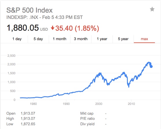
Sure, it looks like the stock market is going “up” over time. But it’s not, really. At least not by nearly that much.
A large part of what you’re seeing is not stocks becoming worth more but rather, dollars becoming worth less. This is a concept known as “inflation”. And once we start to adjust this chart for inflation, we start to see a very different picture:
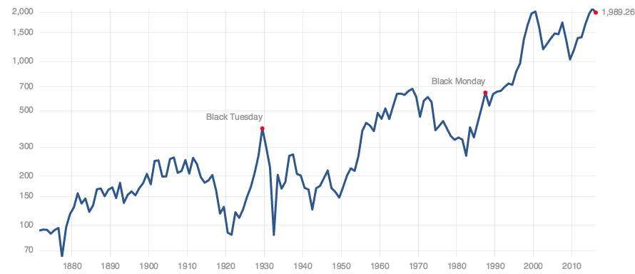
“Inflation Adjusted” S&P 500 Index from multpl.com
This time, we’re zooming out even farther, going all the way back before 1880. Notice that, right now in 2016, stocks are actually still lower in price than they were way back in 1999 and 2000.
This means that the stock market has still not yet recovered in real terms from the great tech bubble. (Excluding the incredibly small amount of dividends you may or may not have earned when buying at those inflated prices.)
But even this chart isn’t quite good enough, because it doesn’t actually track “inflation” at all. What it tracks is “an increase in consumer prices, as measured by the U.S. administration.”
The administration of course, has something of a vested interest in making this figure appear as low as possible, so that that folks don’t get too ornery. And so, there’s a lot of black magic and questionable accounting that goes into creating the “official” figure.
Inflation, more rationally defined, simply means “an increase in the money supply.” So to get a look at what the stock market is really doing, it is best to compare it against something that is relatively more fixed in supply and usefulness than a dollar bill is.
If you were to instead track the stock market in terms of barrels of oil, or ounces of gold, or tonnes of wheat, you start to get a very different picture indeed. Here’s that very same index again, this time, priced in gold ounces:
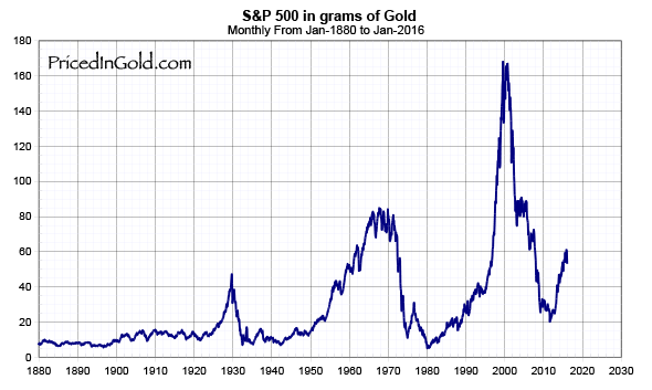
The S&P 500, priced in ounces of gold.
Very interesting. Where has that “upward” movement gone? Is it really there at all?
But even this chart isn’t quite ideal either. I’m not certain that gold is the absolute best measuring stick for a stock price. What’s truly important to recognize is what the real value of a stock is to begin with.
When you’re buying stocks, you’re buying two things:
1) A share in the “earnings” of a real company. (How much money the company makes after expenses.)
2) A share of the “assets” it owns. (How much all of the stuff and money it owns is worth.)
That’s it. Deep down, that’s all there is to buy.
Sure, you’re also making your best guess about whether these two things are likely to increase or decrease in the foreseeable future. But ultimately, that’s about the size of it.
Simply put: The more stocks cost compared to their earnings and assets, the more “expensive” they are. And the data shows that when it comes to stock indexes, the further above the average real price that you purchase stocks at, the further below the average your real returns are likely be.
Let’s look at this in action. Here is the price of stocks once again, this time compared to their past 10 years of earnings. This is known as the “CAPE” or “Schiller” price/earnings ratio, and it is very predictive of future returns:
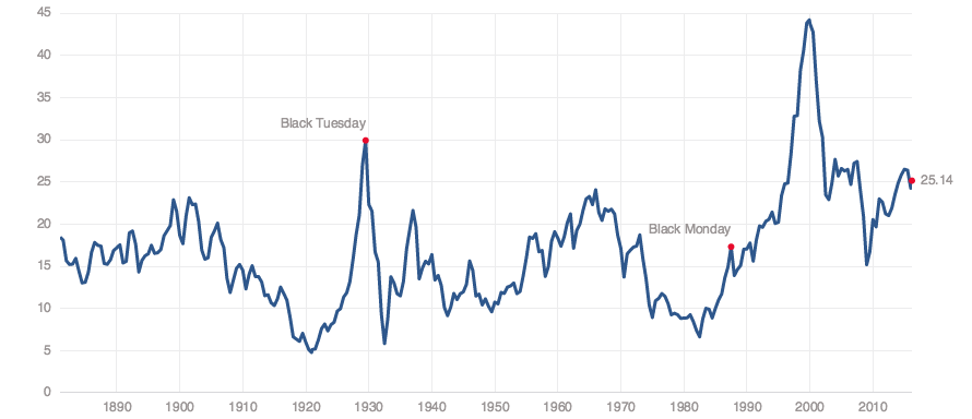
The price of stocks compared to an average of the price/earnings ratio over the past 10 years. The average is about 16. Just before the market started tanking this year, it had ballooned to almost 30. This can be seen as nearly 2x overpriced compared to the average.
One of the first questions to ask when you are thinking about buying stocks is “how many dollars do I have to pay for a dollar of earnings”?
The long-run average is somewhere in the neighborhood of $15 or $16 in price for $1 of earnings. Right before the market started tanking in January of 2016, that ratio had ballooned to nearly $30 for every $1 of earnings. That’s almost double the long term average. And it’s very close to where we were right before the Great Recession.
By this metric, you can confidently say that either the price of stocks (or the value of the dollar) would have to drop by about 40% to return to a more “average” valuation. But it’s worth noting that markets rarely tend to revert right back to average, and instead, almost always seem to overshoot the mark.
For some context, a “price to earnings ratio” of 15 means that it will take you 15 years to make back your initial purchase price out of current earnings. This is an “average” long-term return expectation for stocks, once you strip out inflation. Similarly, a PE ratio of 10 means that it would take you 10 years to earn back your investment, if all continues on more or less as it is. (Granted, the results could be better in practice if the company or index in question is able to increase its earnings during that period. Or they could be worse. Or the earnings could be improved, only to be canceled out by a parallel rise in inflation.)
A PE ratio of 30 however, implies that it will take you 30 years to earn back your original investment. This implies an effective interest rate of under 3%. For all the downside risk there is in stocks, it is hard to see this as anything but a terrible deal.
We can see the same kind of thing happen when we look at the current price compared to “earnings yield“, which essentially means “how much cash the company earns for you every year, just for you owning the stock”:

S&P 500 Earnings Yield. This is the past year of earnings divided by index price.
As you may notice, this is very close to the lowest levels we tend to see.
The average here is close to 7.5%, and we’re currently around 4.5% today, which once again means that stocks would have to drop by 40% to return to average territory.
If history is any guide however, stocks don’t tend to drop back to average. They tend to drop right through it, and often straight through the floor, passing only briefly through the average, and then proceeding to find rock bottom, going into severe undervaluation for some time, before slowly climbing back up to average (and eventually beyond) over the course of many years.
This means that as likely as it is that stocks will drop by 40%, it is even more likely still that they will drop by more than 40%. How much? I don’t know—possibly 45% or 50% or 60% or 80%. It’s anybody’s guess, really. But it’s also worth recognizing that this drop could be hidden somewhat, due to another important factor: Money printing.
Naturally, people tend to get pretty upset upon realizing that their retirement accounts and home values are built on a house of cards. (I can hear some people grinding their teeth right now and trying to rationalize these numbers away.) And so, governments do what they can to try and ameliorate this effect. If the past 45 years of history serves as any guide, they will tend to do this by effectively “printing money”.
In practice, although there is a significant pressure for stock prices to drop by 40% or more and return to fairer valuations, this “drop” could just as easily be accomplished by devaluing the dollar, thereby masking the drop in real prices.
Through this method, you could easily have stock prices drop by only 20% or so and the dollar devalue by 20% or so, and that way, the people don’t get quite as angry in the short term. Or, you could even have the dollar get devalued by 40% or so over a number of years, while the price of stocks remain in place—at least nominally. This is more or less what happened during the long “silent crash” of the heavily inflationary 1970s.
While this “solution” of printing more money in order to inflate asset prices does lead people to be a bit less acutely angry in the short run, it tends to make them stew with anger in the longer run. This approach brews inequality and loss of opportunity, masked by an illusory “wealth effect”, felt almost exclusively by those at the “top” of society.
This kind of thing leads to phenomenon like “Donald Trump” and “Bernie Sanders”. In hindsight, a bit of short term pain in the form of falling asset prices may very well be preferable to the alternative of a lot of long-term pain under the rule of a divisive and authoritarian strongman of any stripe.
So in short, of course you can know when stocks are expensive. You can look at their price compared to their earnings. You can look at their price compared to their assets, also known as their “book value”. You can look at their price compared to their dividend yield, which is how much you get paid simply for owning a stock.
It’s really not that complicated, especially when we’re talking straight index fund investing: All other things being equal, if you pay more for earnings and retained assets, then you tend get lower yields than if you pay less for them.
You can—quite easily—look at historic averages for these figures to help see where we are in the business cycle for stocks. Look at their price compared to earnings, to book value, or the price to “dividend yield”. Compare the price of stocks to other hard assets like commodities and real estate. Compare the likely return on a stock purchase to the likely return on an education. (And I mean a real education. Not the kind you tend to get in most schools.)
In the world of investing, this should be considered very basic stuff. The idea that a person can’t tell when stocks are overvalued is simply absurd. If you really believe that, it only means that you don’t yet understand how stocks are meant to be valued, and would probably be wise to learn the basics before you consider going and putting all of your money into them.
As always, I cannot give you investment advice, but I can tell you what I am doing: I do own some US stocks that were bought back when they were more fairly valued. I have sold some and kept others. I also also own some undervalued commodities, as well as some foreign stocks that still have more attractive valuations.